Enrich Topbar using extension point
This tutorial adds further explanation on how extension points work and how even with Devkit, we are able to interact with extension points on other apps or widgets in a world. You can learn more about Extension Points and take a look at a related tutorial on how to create extension points.
The fully working implementation is available on the devkit's examples/extension-point branch
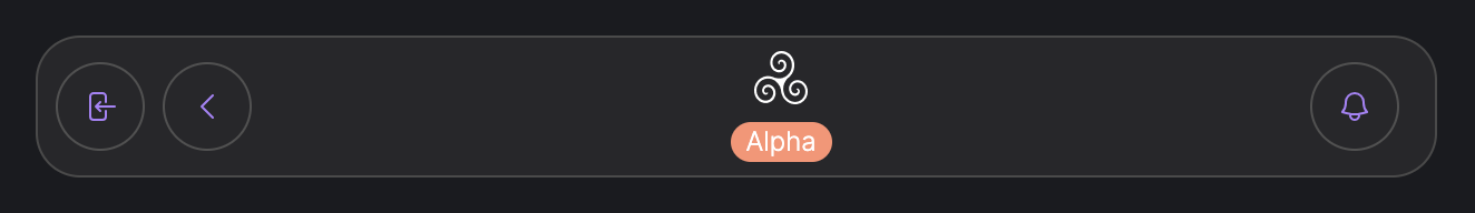
Before you proceed, be sure you have cloned and set up the Devkit locally or on a DevContainer. Your topbar should look similar to the image below (dark theme)
For this tutorial, we are going to consume already established extension points in the topbar. This will allow us to add a couple of buttons to the topbar, from the Devkit. Take a look at the how the Extension Point component is defined in Akasha Core. To add this functionality to your app, simply use the same component, add it in the area you wish to extend, then give it a unique name.
- Let's get started by creating two new components (extensions) in the Devkit's
srcfolder. These components are simple buttons which when clicked, logs an output to the console.
cd src
mkdir extensions
cd extensions
touch button-a.tsx
touch button-b.tsx
- Open the first file, then copy and paste the code snippet below
import React from "react";
import { withProviders } from "@akashaorg/ui-core-hooks";
import { IRootExtensionProps } from "@akashaorg/typings/lib/ui";
import { Button } from "../components/ui/button";

const Component: React.FC<IRootExtensionProps> = () => {
  const handleButtonClick = () => {
    console.log("Button A clicked");
  };

  return (
    <Button
      style={{ backgroundColor: "lightslategray" }}
      variant="outline"
      size="icon"
      onClick={handleButtonClick}
    >
      A
    </Button>
  );
};

const ButtonA = (props: IRootExtensionProps) => {
  return <Component {...props} />;
};

export default withProviders(ButtonA);
In the code snippet above, we defined a component which returns a simple button with a click handler. The props that could be passed to this extension is defined in the typings package.
- Let's do a similar thing in the second file
import React from "react";
import { withProviders } from "@akashaorg/ui-core-hooks";
import { IRootExtensionProps } from "@akashaorg/typings/lib/ui";
import { Button } from "../components/ui/button";

const Component: React.FC<IRootExtensionProps> = () => {
  const handleButtonClick = () => {
    console.log("Button B clicked");
  };

  return (
    <Button
      style={{ backgroundColor: "mediumpurple" }}
      variant="outline"
      size="icon"
      onClick={handleButtonClick}
    >
      B
    </Button>
  );
};

const ButtonB = (props: IRootExtensionProps) => {
  return <Component {...props} />;
};

export default withProviders(ButtonB);
- We have defined the two components we want to mount on the topbar's extension points. The next step is to tell Devkit exactly where to mount these components. For this tutorial, we are mounting them on
topbar_notification_buttonandtopbar_extension_rightslots in the Topbar. We do this by updating the register function in thesrc/index.tsxfile
import {
  IAppConfig,
  IntegrationRegistrationOptions,
  MenuItemAreaType,
  LogoTypeSource,
} from "@akashaorg/typings/lib/ui";

/**
 * Changes in this file requires a full reload in the browser!
 */

const SidebarIcon = () => (
  <svg
    xmlns="http://www.w3.org/2000/svg"
    fill="none"
    viewBox="0 0 24 24"
    strokeWidth={1.5}
    stroke="currentColor"
    className="w-5 h-5 stroke-secondaryLight dark:stroke-secondaryDark"
  >
    <path
      strokeLinecap="round"
      strokeLinejoin="round"
      d="M9.75 3.104v5.714a2.25 2.25 0 0 1-.659 1.591L5 14.5M9.75 3.104c-.251.023-.501.05-.75.082m.75-.082a24.301 24.301 0 0 1 4.5 0m0 0v5.714c0 .597.237 1.17.659 1.591L19.8 15.3M14.25 3.104c.251.023.501.05.75.082M19.8 15.3l-1.57.393A9.065 9.065 0 0 1 12 15a9.065 9.065 0 0 0-6.23-.693L5 14.5m14.8.8 1.402 1.402c1.232 1.232.65 3.318-1.067 3.611A48.309 48.309 0 0 1 12 21c-2.773 0-5.491-.235-8.135-.687-1.718-.293-2.3-2.379-1.067-3.61L5 14.5"
    />
  </svg>
);

export const register = (opts: IntegrationRegistrationOptions): IAppConfig => {
  return {
    rootComponent: () => import("./components"),
    mountsIn: opts.layoutSlots?.applicationSlotId as string,
    menuItems: {
      label: "Extension Devkit",
      logo: { type: LogoTypeSource.ICON, value: <SidebarIcon /> },
      area: [MenuItemAreaType.UserAppArea],
      subRoutes: [],
    },
    extensionPoints: [
      {
        mountsIn: "topbar_notification_button",
        rootComponent: () => import("./extensions/button-a"),
      },
      {
        mountsIn: "topbar_extension_right",
        rootComponent: () => import("./extensions/button-b"),
      },
    ],
  };
};
Refresh the entire page and you will see two buttons added to the topbar like in the image below. Feel free to interact with them and check your console for the output.
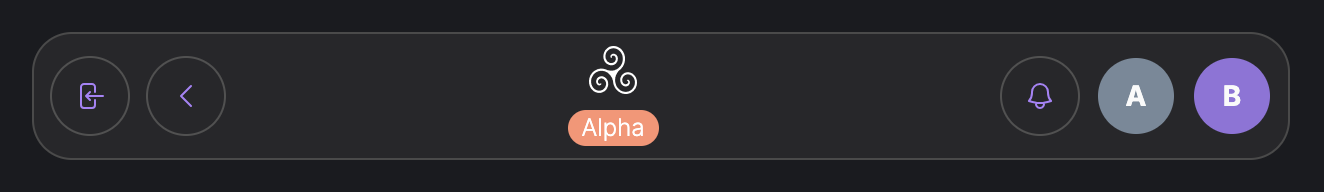
Congratulations, we have now interacted with extension points defined on another part of the World, from the Devkit. Go ahead, tweak the codes and make some magic with other extensions points in Akasha World.